Time for another update on our portfolio! Yay!
We are so happy to finally tell you a bit more about this one. This has been a project we have been working on for quite some time, as it started from scratch and we have been developing it quite a lot over the last year. It started with a simple brand identity then expanded into more things which we are super excited to show you today.
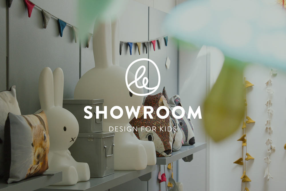
Le Showroom is a lovely shop in Luxembourg city, providing design products for kids, held by owner Carole & her helper Estelle, two really sweet and vibrant women which we had the pleasure to meet! Being quite the opposite of an average cluttered toy-shop, their personal selection is very well curated to provide products with a very simple and pleasing aesthetic. Everything in this shop is selected with purpose and creates an ambiance that is calming and soothing to be in.
What we also really liked about it is that they also provide furniture and beautiful things for the home, which makes its approach quite complete and not just aimed at people who have kids, but also adults who want to find dreamy little treasure to decorate their interiors with.
This is an approach that Carole brought with her when becoming the new owner of the shop. Since this was going to be a new chapter for Le Showroom, it also meant that it was the right time to start fresh with a well-adapted brand image.
When we were approached to design it, we knew right from the start that the goal would be to create something that is simple and breathable, having playful & soft elements to it without being childish. A visual route that would represent exactly what the shop feels like.
We brought quite a few alternatives to the table and then we decided to simply play with the “Le” (from Le Showroom), in order to create a playful yet abstract symbol out of the word itself. The rest had to remain quite minimal and clean to not be cluttered and look professional. We could get a little funkier with shaping this particular word, so we started it from hand-lettering and then gradually turned it into a round, fun symbol!
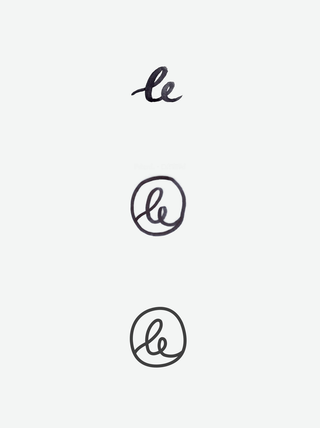
We then digitised it and integrated it right into the logo. This allowed us to still have a logo that looks quite minimal, but with just a little simple symbol that brings a bit of fun and playfulness.
We then styled the rest of the branding by looking for the right colors and elements.
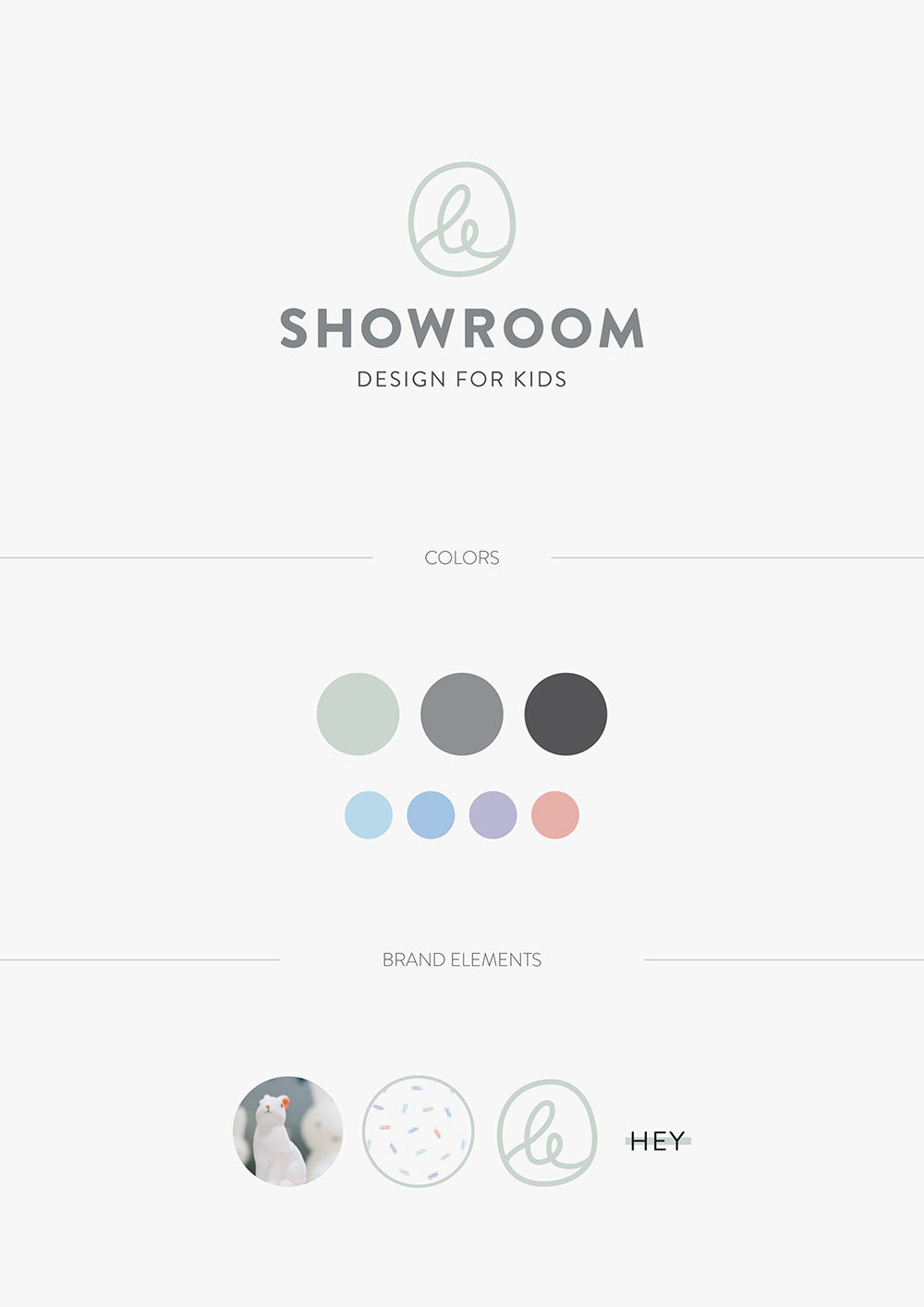
The main color we selected for the brand image is a washed out blue-grey, as it reminds us of the nordic, minimal interiors that inspire the shops selection of furniture. The shop itself was full of soothing, washed out pastel colors so we knew it had to be something in that line. The first colors we had picked were light greyish pinks, but this bluer tone remained a better choice to stay gender-neutral.
Further along, we also added a handful of extra colors to the brand image (as you can see in the smaller circles), which would be used for special occasions. The giftcards, for example, have a festive pattern of sprinkles in all these colors, to add an extra playful touch! You can see in the board below, under “brand elements” 🙂
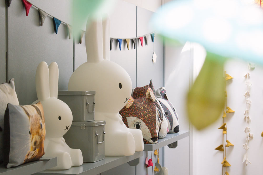
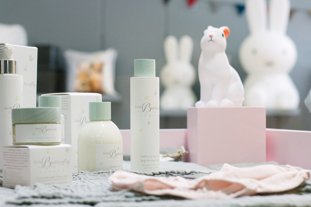
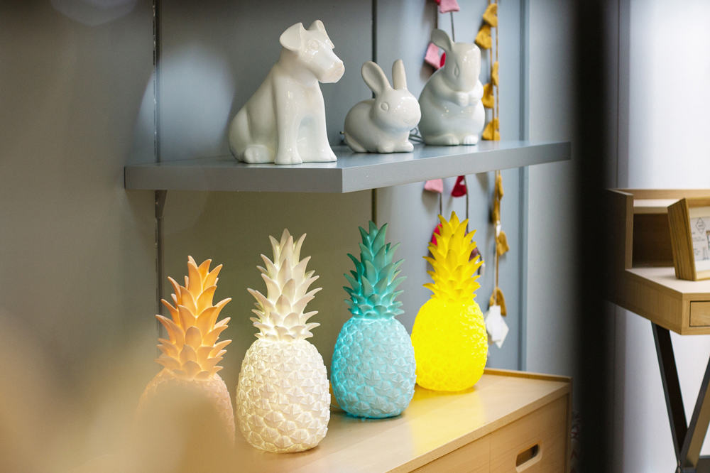
We also took some time to photograph the shop’s interiors, as they are definitely representing the brand as well. So many beautiful little things to look at!
One of the latest projects which we have completed was designing and launching Le Showroom website!
We are so happy about this one, as it’s also in the same minimal approach. We are quite happy with the products page (“collection”). Together, we decided to not make the website into an e-shop, but this page is quite useful to see the stuff that’s in shop and get inspired to visit!
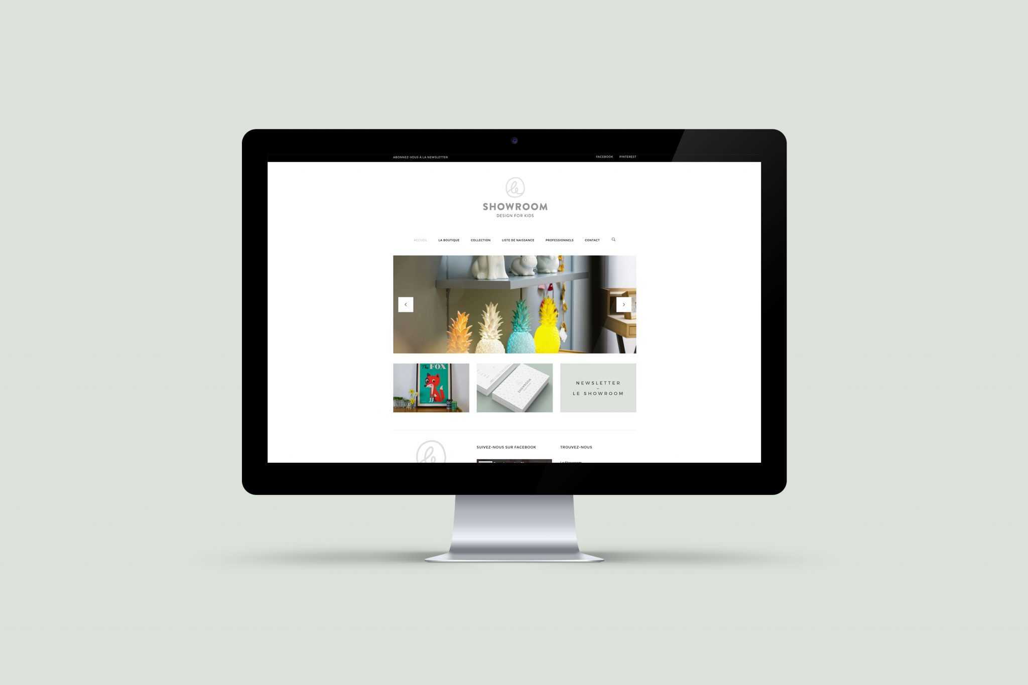
Feel free to go have a look at the website here!
Last but not least, we have been working on some really fun prints such as funky cards and handcrafted stamps with we made in collaboration with lumi. As soon as we’ll be able to get a few shots of them, we’ll add them in this post too, so stay tuned for the update 🙂

