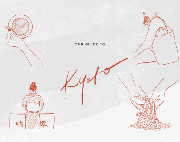
This last year, David and I have been working with quite a lot of bloggers and have actually been spending a lot of our time designing (including ours)! It’s been a very interesting field to experiment in, as every blog is different in content and in concept, and every blogger has different goals to reach: food bloggers who want to make a living out of it and collaborate with brands, creative travel bloggers who want to use their blog for storytelling & inspiring, fashion bloggers who want to experiment with style… It’s really interesting and we quickly learned that every detail counts.
In fact, we have learned so much about designing blogs that we decided to share our knowledge and create ressources that aspiring bloggers can use, even when they don’t have the budget to hire us to design everything for them. In may, we will be running our first “blog styling” workshop, which we are super excited about.
When we are designing blogs, we like to customize every little styling detail and perfection every little function to fit exactly the blogger’s purpose and attract the right audience. However, one thing is totally clear when it comes to keeping blog readers hooked and coming back for more is: great content & a beautiful blog.
We believe that having a beautiful blog layout means paying attention to the bigger picture such as your editorial line and appearance, but also perfecting the little details that do make a difference in the way content appeals to the reader.
Here are some of our most simple & useful tips!
#1 ART DIRECT YOUR IMAGES
First thing to keep in mind: we are all visual creatures and so are your readers! Posts without images won’t attract any attention to them. So be sure to pay attention to the visual aspect of your post, whether you are using your own photography or images from the internet (which you are using following a good etiquette). Also and most importantly, make sure that the style of images used in your post stays pretty similar in terms of color and ambiance. Confused about what your style should be in the first place? Try doing a moodboard to help you determine it exactly! It’s a very helpful exercise.
#2 ADJUST IMAGE SIZING
Image sizing is important, both when it comes to a blogpost and a blog’s design itself. In your blogposts, make sure to always keep all your photos in the same width. Pay attention to the image quality and look for images that are at least 800 pixels large, so that they automatically take up the width of your post in size. We really recommend that, as that’s when they’ll look their best and create a consistent flow.
Also be quite careful with the size and proportions of your featured images. Sometimes, when those images are in the wrong proportions, they don’t show nicely within the blog’s design. How to fix that? Use measuring tools from your browser to help you determine what size they should be, then always crop and export your featured images in that size, they will fit right in and look great.
#3 DECLUTTER YOUR SIDEBAR
Tons of clutter on your sidebar is not a good thing. Minimize the amount of items you have on there and keep only what is important to you. If you have advertisements, spread them out among your categories and archives, so it doesn’t look like one big ad page. Also be selective with what ads you use, don’t go for things that create distraction or make your blog look cheap (like some google ads can). Your ads should look like they fit right in (in terms of content and of looks). I guess I will soon be writing another post on how to art-direct your ads for the more advanced bloggers among you 🙂
Have a blogroll on your sidebar? While they are very supportive, they take up precious space. If you’re insistent on doing a blogroll, we recommend a single post that you can link to from your sidebar VS having a long list.
Pay attention to the main things your sidebar should do, like present your blog and connect to your social media. Use an attractive profile picture and a readable short description (yes! it’s important and it’s what welcomes people into your blog!). Use minimal social media icons that are not too big or distracting, or maybe even a few (not too many) social media widgets that display your pretty instagram feed for example.
#4 KEEP YOUR MENU SIMPLE & FUNCTIONAL
We always recommend to use less than 6 items on the header menu, otherwise it may look like a mess and will be difficult to navigate. When everything is clean and simple, your blog content will be the thing that stands out. If you have a variety of blog categories, you can use a dropdown menu which appears when you hover “CATEGORIES” or “BLOG”. We are quite happy about the way it looks in this blog design we created.
For the more advanced bloggers among you, you can even try to use a double menu: one with your main info pages (about, press, collabs) and one to navigate your post categories, like in this blog.
#5 PROOFREAD YOUR POSTS
This one’s pretty obvious (I think), but pay attention to the spelling + coding errors within your blog, as they can make it look sloppy. Always double check for spelling errors and format issues. We sometimes will revise posts a dozen times to make sure it’s all perfect before posting 🙂
#6 DESIGN WITH CLASS
It’s fun to experiment with new fonts and layouts, and if you’re a creative person with a few skills in photoshop, why not design your own images? You must, keep in mind what your brand consists of and stick with it as much as possible. Try to make sure that your fonts and colors match the rest of the blog and don’t seem like they’re odd. We recommend using minimal fonts and simple colors, as it’s quite a foolproof way to make pretty layouts.
#7 KEEP IT EASY
I’m one of those people who is guilty of writing long posts most of the time. Long posts are not necessarily a no-go, especially if they’re useful content, but it’s important to know how to balance them out and make them fun & readable. Keep in mind that people don’t like to read super long paragraphs. If you break your text into multiple paragraphs and make it fun to read by formatting the text nicely (using bold titles or listing things) or maybe even separate with images spread along your post, it’ll keep your readers wanting to know what comes next. Keep it breathable and entertaining!
#8 SIMPLIFY YOUR POST TITLES + CATEGORIES
What’s your blogpost really about? What are your categories providing to your reader? Keep your titles inviting, functional and minimal: don’t use long sentences or tons of tags. Long titles or categories will also not look very nice in your blog layout, as they will take up too much space.
Good luck!