Last week’s Illustration Friday challenge gave me a pretty good high. In fact, it even allowed some quite unexpected new opportunities to happen… But more on that later (trying to keep the suspense even if I’m excited like a little girl!).
Since this very interesting experiment brought so much positivity into my life, I decided to stick with it, and see what I come up with this week.
This week’s theme word is “Smart”. Boy, that started some serious brain picking around here. I had to get my smarty-pants on: “but what exactly defines SMART?“. Oh, and to make it even more vast and confusing, let me remind you that the word smart has different meanings in the UK and in the US. Smart can mean chic & dapper in one country and it can mean intelligent in the other one. For a moment, I thought that this double-meaning characteristic could be interesting to pursue creatively. What about representing things that make one look smart, in both senses of the term? So I started thinking out loud to come up with the perfect “smart” person’s toolkit to illustrate. Needless to say, some rather stereotypical things came out at first. But as I was looking to make this toolkit more interesting, I started doing a bit more research, and thought it would be a good idea to infuse a little bit of history in there. What did the smartest people on earth (intellectuals, scientists, inventors) use as tools?
There I was, looking for the most interesting objects to draw. Tools that are symbols of intellect in history. But I quickly realized that this research wasn’t so fruitful. I did learn that Leonardo Da Vinci had a sketchbook, but that was no surprise, of course. What did these incredible people use? Well, not much more than their own brain, actually. The brain is their most powerful tool. Too bad I was not too interested in sketching a brain though.
And then it struck me. What if I would simply strip off layers of history, of evolution, and represent the ultimate first tool that was invented by the “smarts” of humankind?
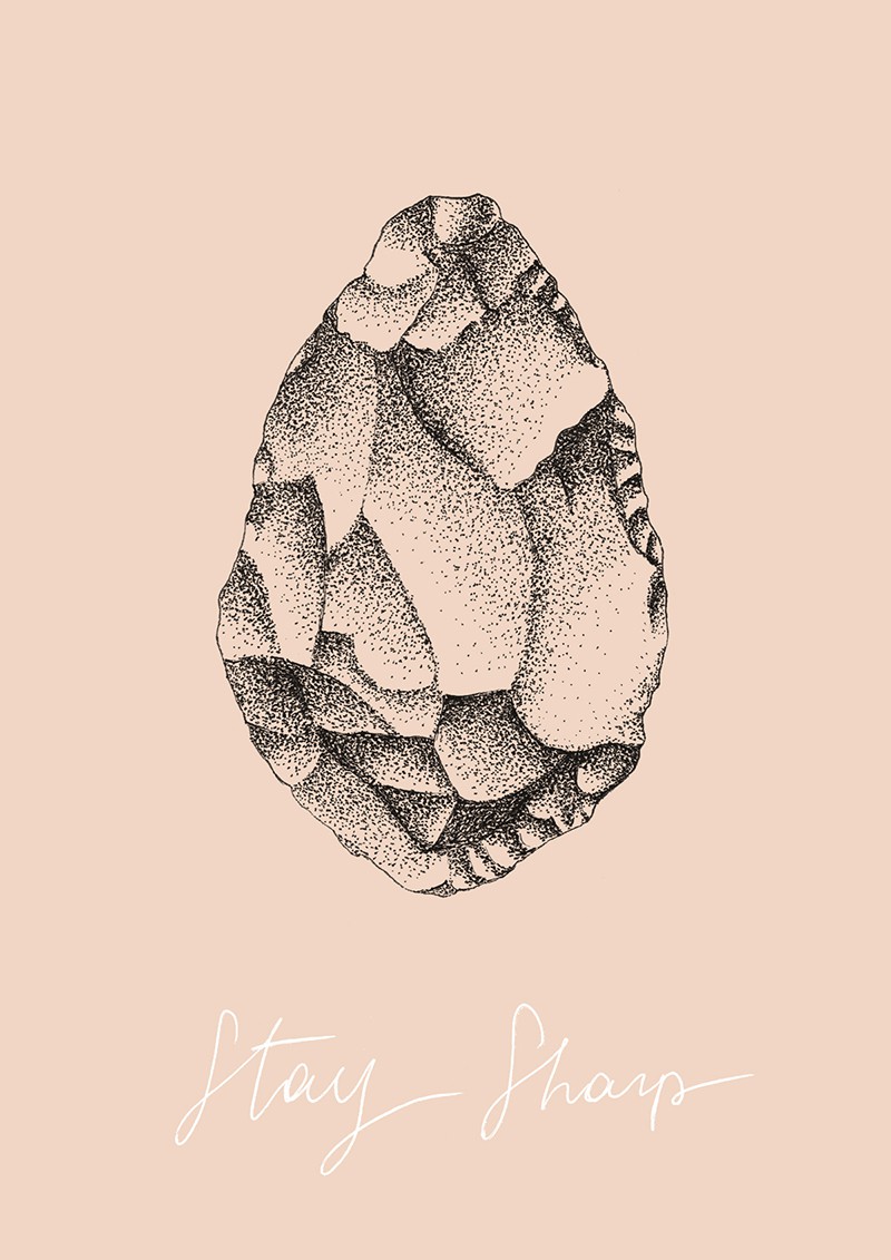
So I found my little illustration muse. The hand axe. A prehistoric tool with two faces that is the longest-used tool in human history, and the first to be made, out of flint or other rocks. With a beautifully knapped surface that I knew would be fantastic to draw in dot-work.
The hand axe represents “smart” in its raw state. It is one of the first tangible solutions to a problem. Yet, this marvelous tool served in various ways: butchering, digging, chopping, hunting, shaping…
Hand axes were also called «Thunderstones» because popular tradition held that they had fallen from the sky during storms or were formed inside the earth by a lightning strike and then appeared at the surface; in fact they are still used in some rural areas as an amulet to protect against storms. Perfectly mystical element if you ask me.
So I drew the multiple angles of this rock, and then I spent a little more than two hours dotting away this geometrical shape. My hands were pretty tired after that (I can still feel the dotting motion like a sewing machine). When I scanned it in, I knew I had to layer it on top of a color reminiscent of flesh & skin, without necessarily getting too raw about it. Just as a flat color background and nothing else. I am so happy about the result. Composition-wise, I stuck with a similar layout as in the last illustration I made: main element centered, with my handwritten scribbled font underneath. I’m quite keen on this for the moment and it just made sense to me as I really wanted to put all the visual attention on the rock, avoiding any frills. I’m embracing minimalist creativity a lot these days and I’m liking that a lot! Everything just starts to make so much sense when you strip things down to the essentials, both concept-wise and styling-wise.
And guess what… I decided to even turn it into a downloadable desktop background.
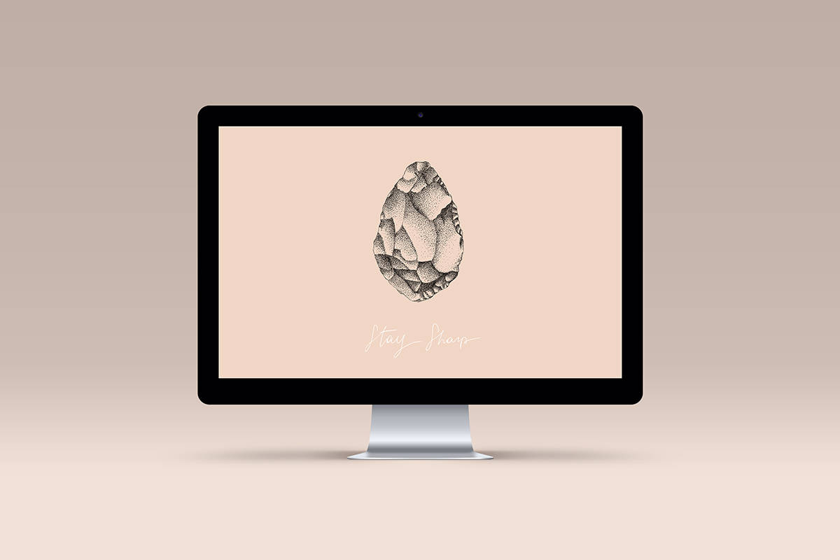
So if you want to add a little sharpness/smartness onto your desktop, feel free to download here! (widescreen resolution 1920 x 1200 px).
Here’s a tip from me that I learned by experimenting on this illustration, and from my background as a designer: when you are stuck experimenting and getting a little too lost when creating, rewind and remove things that are non-essential or that just don’t make sense visually. When you remove the unnecessary, things are cleaner and it will be easier to get your creative message across, or bringing the eye to what is important to you.
I would be absolutely thrilled to hear what you think about it!

