Hey folks!
It’s time I share my second post in this series of articles about BRAND STYLING. We’ve heard some pretty good feedback after our first post in the series, and it seems plenty of people are finding these posts quite helpful. That makes me so happy and very eager to continue!
Let’s do a little recap. What is brand styling all about? It’s the visual personality in your brand or your project. If done properly, it will capture the message, vibe and philosophy you want to communicate and attract the people you want. This series of posts will serve as a resource for those of you who want to learn more about how this whole design process works or want to know how to make the best out of it. Whether you’re a designer or someone who is interested in getting designs (or re-designs) for your business, blog, or project: this is for you!
In the last post, called “The Starter Q&A”, I provided a series of questions which are vital to beginning this process. If you haven’t read this one yet, I highly recommend you do, there are some really helpful questions in there that you can ask yourself and the answers should help you reflect and clarify the essence of your business and set up some mental goals.
What’s the next step then? Now that you have done the “theoretical” part of your homework, you’ll have a bit of “visual” homework to do. It’s not any less complex, but I guess it’s more fun and exciting: let’s make a moodboard.
A mood board is a type of collage that may consist of images, text, and samples of objects in a composition. Together, all of these elements help to provide a visual inspiration board. Three reasons to do it:
- It will help you pull out some things that attract you, and therefore give you a better understanding of what inspires you.
- It will help you structure that inspiration. You might be lost or have plenty of ideas, but the mood board will help you define what’s important.
- A mood board helps you get closer to visualising your brand identity, so it will save you time and avoid disappointment when designing it or hiring someone to.
I used to see mood boards all over the place while browsing the internet and they always looked so inspiring and nice. Truth is, I had never even thought about how useful they could be too! I then started creating them just before working on a logo or a brand identity, and let me tell you: it’s one of the most helpful things ever. Sometimes, when done well, it even helped me to already imagine a finished idea for what was coming up next.
STEP 1: KEYWORD IT
Gather up 3 to 5 keywords or adjectives that sum up what your brand image should feel like, visually. What should people feel when they look at it?
Is it Light? Minimal? Colorful? Bold? Edgy? Earthy? Inviting? Luxurious?
STEP 2: GATHER
Now that you’ve found your visual keywords, the fun part can begin! Start collecting whatever you’re attracted to, and whatever makes you inspired for your project. You can keep your keyword adjectives in mind as a reference, yet trust your instinct. Grab hold of things that attract you to them, and start putting them aside for your moodboard. It can be:
- Photographs (whether you like them because of the composition, the styling, the colors or what you feel when you look at them)
- Colors & textures
- Illustrations & Graphics
- Words, Typography
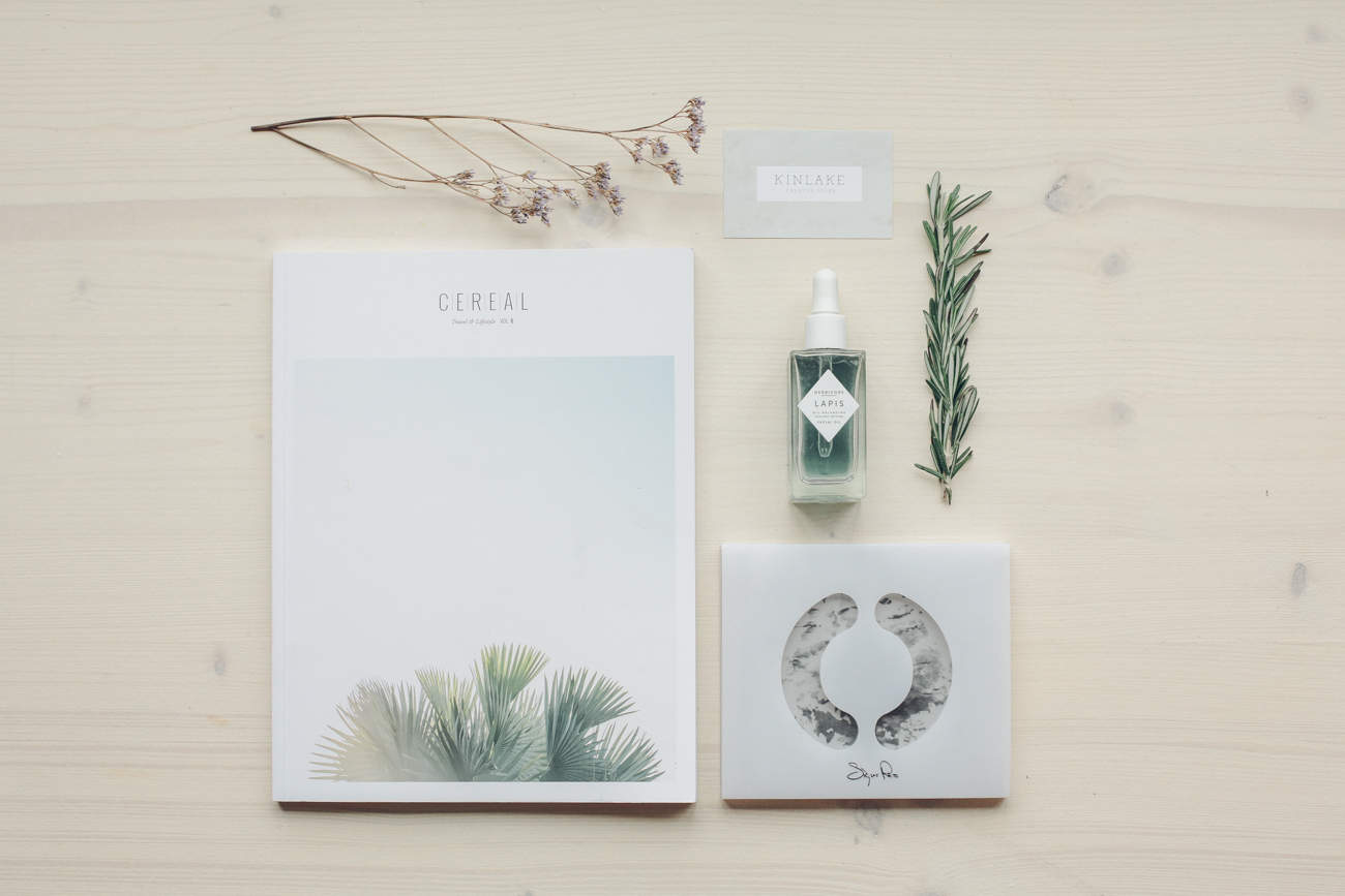
- Objects
Just collect whatever “speaks” to you visually!
STEP 3: GET YOUR MOODBOARD ON
To me, there are three ways to create a mood board:
- The easiest: Use Pinterest and create a pin-board. The only problem with Pinterest, is that you can easily get lost among all of the things that you liked and pinned, so make sure that at the end of your research, your pinboard truly helps you visualize. Erase all things that don’t fit in or make it look chaotic. I would recommend to keep a maximum of 15-20 pins on it.
- The wildest: Go old school and get yourself some magazines or prints to cut out from, or collect things that inspire you: foliage, textures, textiles, colors… Pin all of that on a board, or make a real collage using a large sheet of paper.
- The cleanest: Save the elements for your mood board, then do the collage digitally, using photoshop or whatever you have. I’m pretty sure there are plenty of tools online as well!
STEP 4: EYES ON TARGET
Remember what you need the mood board for. Maybe you’ll have to “re-structure” what you collected a couple of times, erasing things that are non-essential. If, like me, you’re using Pinterest to gather inspiration, you’ll know how easy it is to get distracted. Sometimes I find myself getting lost and collecting images that don’t quite match what I have in mind, forgetting my vision. There are some awesome images out there but it’s important to focus! This does take a bit of practice, but the more you’ll be able to streamline what inspires you, the better your moodboard will be.
The bottom line is: collect as many things as you want, but stay connected to the mood you want to create. You might have to delete a few in order to create a good mood board that is helpful to you.
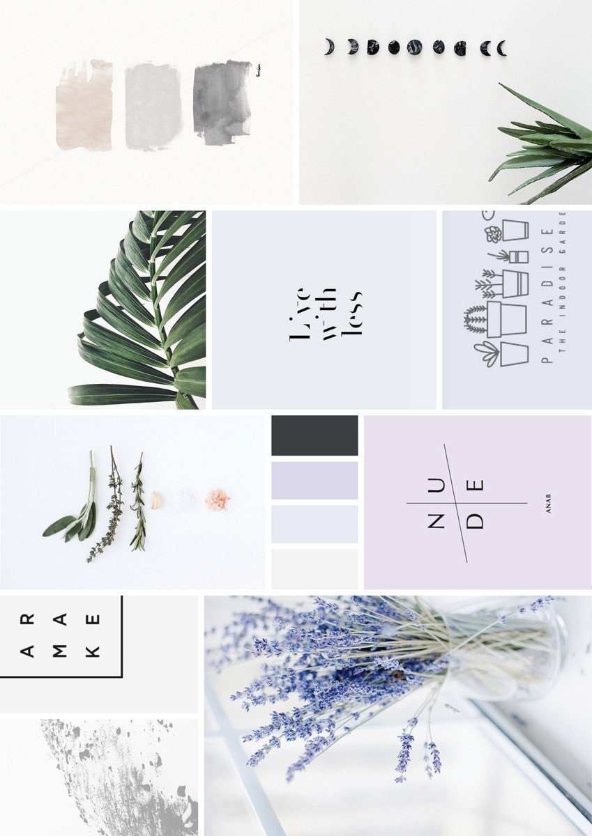
This is a recent moodboard I made for Room To Breathe, a project that we’ll be revealing more about soon 🙂
Step 5: FEEL IT
Which brings me to my next point: Try to have a range of images in your mood board. Don’t just put only graphics for example, or scenery. Try blending patterns, type, textures with images. It helps you have a great chance of grabbing just the correct mood for your project. As a final touch I love eye-dropping the primary colours of my mood board and putting them into color blocks. Color blocks can be helpful to make your mind “lock” the mood of your board. Besides, they also help you find the perfect color palette for your project.
A mood board takes a bit of practice at first, but it’s super fun to make, and will save you so much time with your project. It will also help you have a visual guide for it, which you can trust and use when building your brand, or even refer back to it when you reach a turning point or want to try something new.

